Build a real campaign for a fictional pouch, without claims it can't back up.
XYLO is my concept nicotine pouch, positioned mouth-first, with no health claims, where Zyn, On! and Rogue compete on flavor, strength and lifestyle. The sprint brief asked for a portable-ritual campaign. My job was to keep the brief's system and put the brand's real idea up front, on the can and in every ad.
Creative angles
Each one tests a different reason to care, all laddering up to the same promise.
Finished assets
Two reels, one carousel, one static and three alternate hero openings, plus a bonus detail loop.
Rule I didn't break
No health or performance benefit implied without proof. That shaped the can as much as the ads.
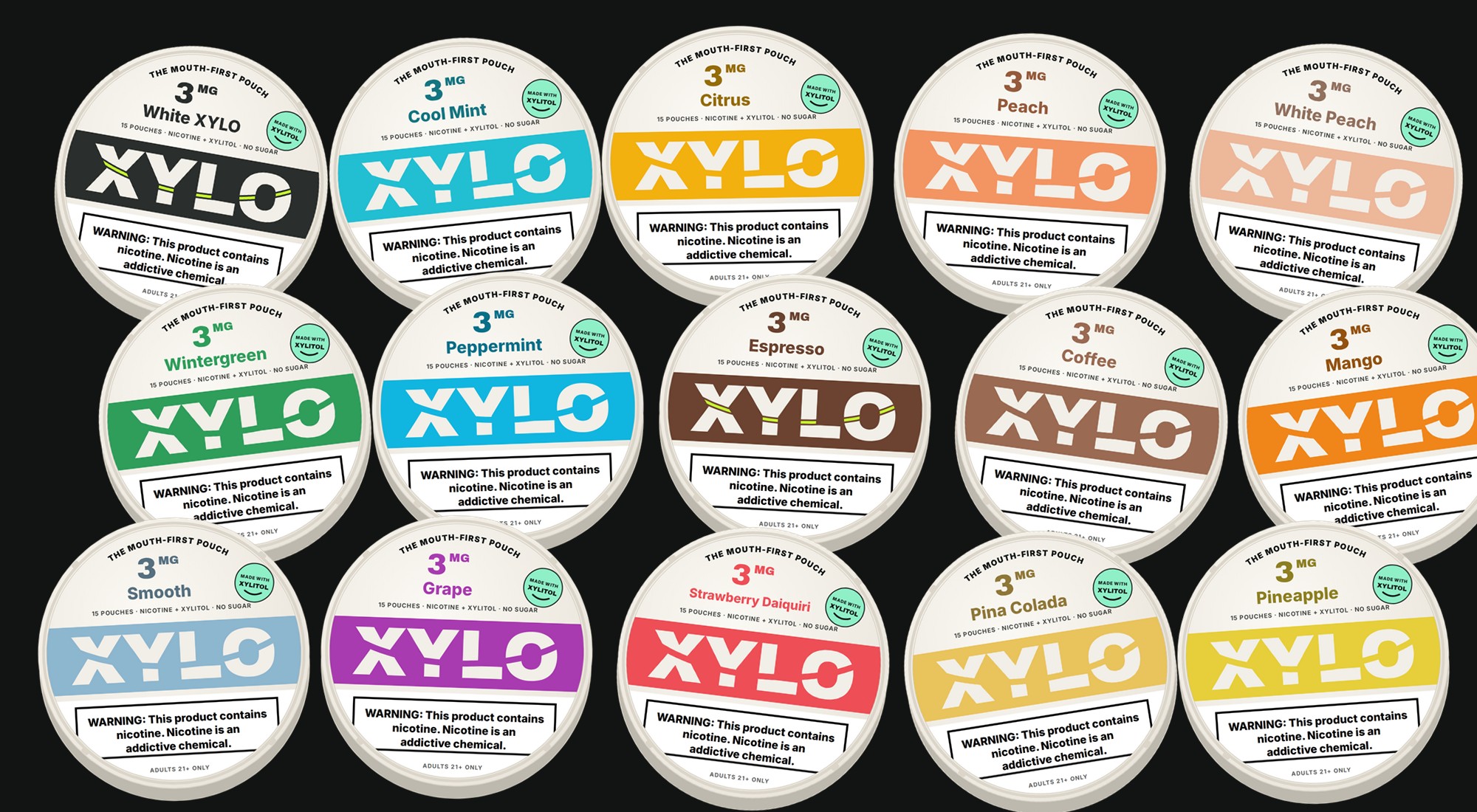
The slash became a smile.
The original wordmark was cut by a straight diagonal slash. Now the cut curves up at both ends, so the word smiles. It's the mouth-first idea in the logo itself. On dark surfaces, a lime line fills the smile.
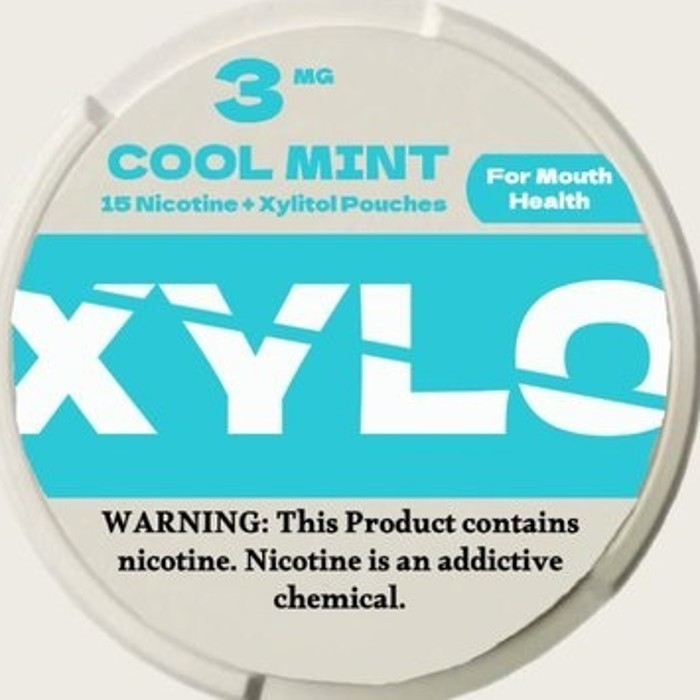
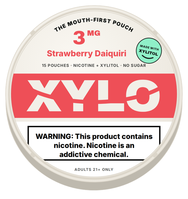



“The mouth-first pouch” runs around the top of every lid. The xylitol seal sits next to the strength, where shoppers look first.
On a nicotine product, a mouth-health promise counts as a modified-risk claim and needs an FDA order. The new line keeps the idea and backs it with facts: made with xylitol, no sugar.
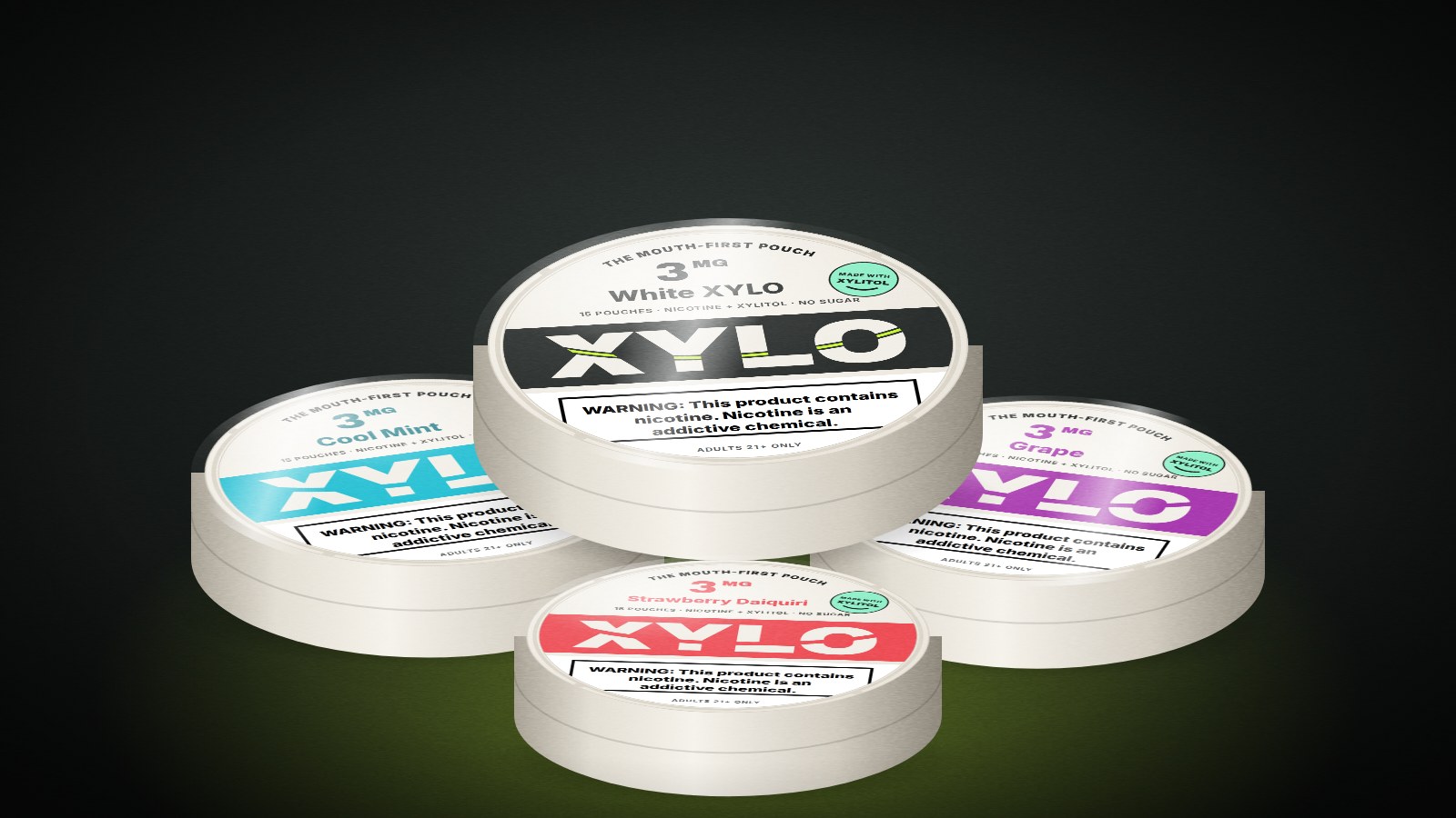
3 mg on every lid, in the same spot. Flavor color lives only on the band, so the line reads as one family.
Black on white with a border, on the lower panel, sized to the 30% rule for the two main package panels.
One positioning system keeps five angles on brand.
For adult pouch users who keep moving, XYLO is the mouth-first pouch: made with xylitol, no sugar, one 3 mg strength, in a can that looks like you chose it.
Audience
Style-aware adults 21+ who already use pouches, with days that move between work, workouts, nights out and travel.
Tension
Every pouch brand fights over flavor and strength. None of them talks about the part the user actually feels: what's in the pouch and how it sits in the mouth.
Promise
A pouch built mouth-first that fits the carry without taking it over.
Reasons to believe
Made with xylitol. No sugar. One strength. Clear product facts on every asset.
Voice
Direct, kinetic, minimal. Short sentences. Concrete verbs. No fake swagger.
Message ladder
Emotional: I feel ready to move. Functional: It fits the rhythm of my day. Proof: Made with xylitol, no sugar, 3 mg.
Product truth sheet
| Category | Nicotine pouch, tobacco-free. Fictional brand, working definition. |
|---|---|
| Use case | Adults 21+ who already use pouches, between moments in a moving day. |
| Ingredients | Working definition: 3 mg nicotine, xylitol as the sweetener, plant fiber, flavorings. No sugar. |
| Experience | 15 pouches per can. One strength. Fifteen flavors. |
| Allowed claims | “Made with xylitol.” “No sugar.” “3 mg.” Flavor names. Design and portability. |
| Prohibited | “For mouth health,” better for teeth or gums, safer, healthier, quit claims, anything aimed at under-21s. |
| Required copy | Nicotine warning on the top 20% of every ad and 30% of the main pack panels. “Adults 21+.” |
Under federal law, marketing a tobacco product as reducing risk or harm requires an FDA modified-risk order. The positioning stays loud; the claim stays provable.
Black on white, bordered, in the upper portion of the ad, per 21 CFR 1143.3. Every frame of every reel was designed below it.
Meta's ad standards and TikTok's ad policies don't allow ads that promote nicotine products. The formats here are built for age-verified placements: the brand's own site and email to verified 21+ customers, retail screens, and age-gated programmatic.
Five angles test five reasons to care.
All five went to thumbnail first. Angles 1–4 were fully produced, and angle 5 became a bonus detail loop once the core four were done.
 Produced
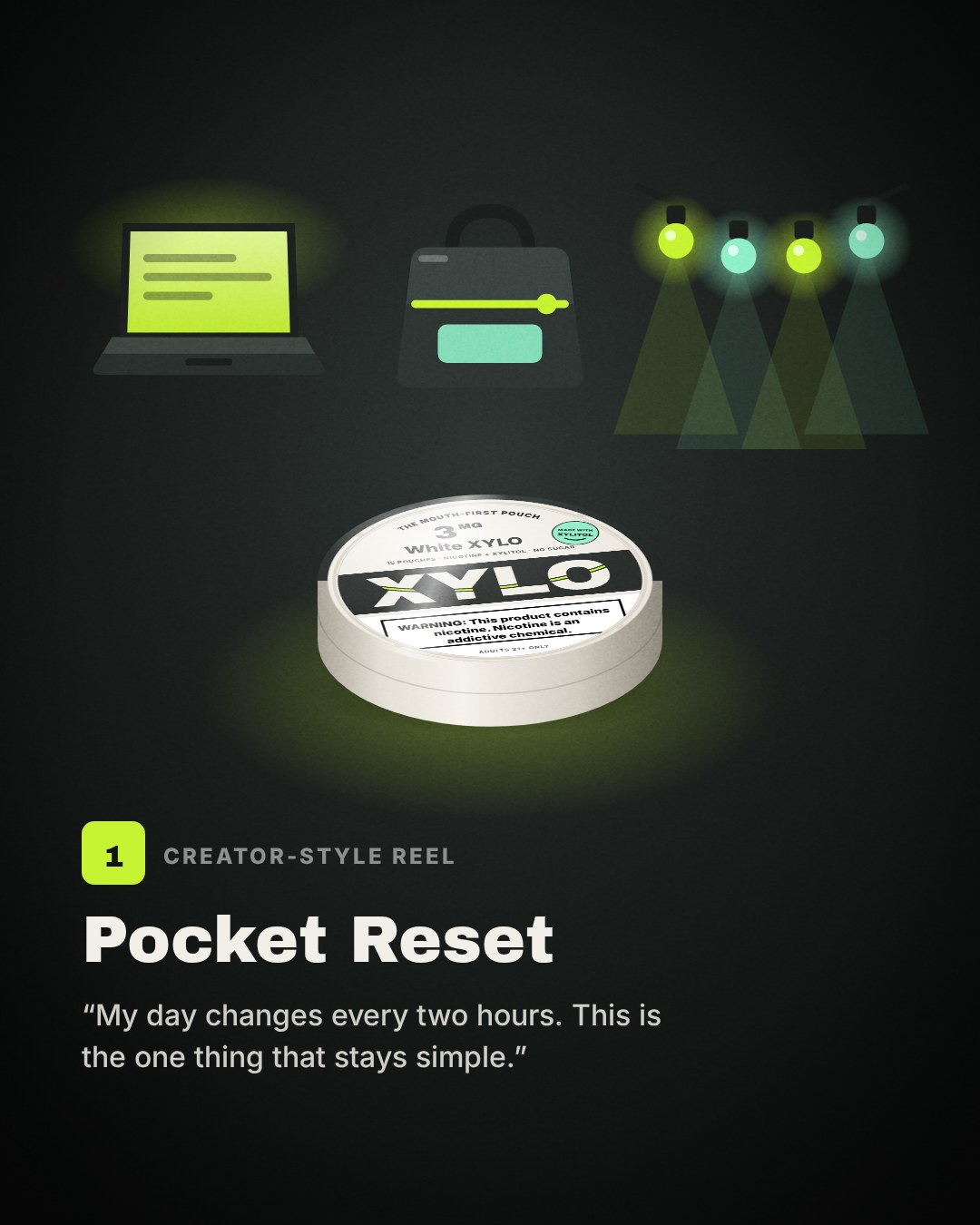
Pocket Reset. Tests control: one simple thing between changing moments.
 Produced
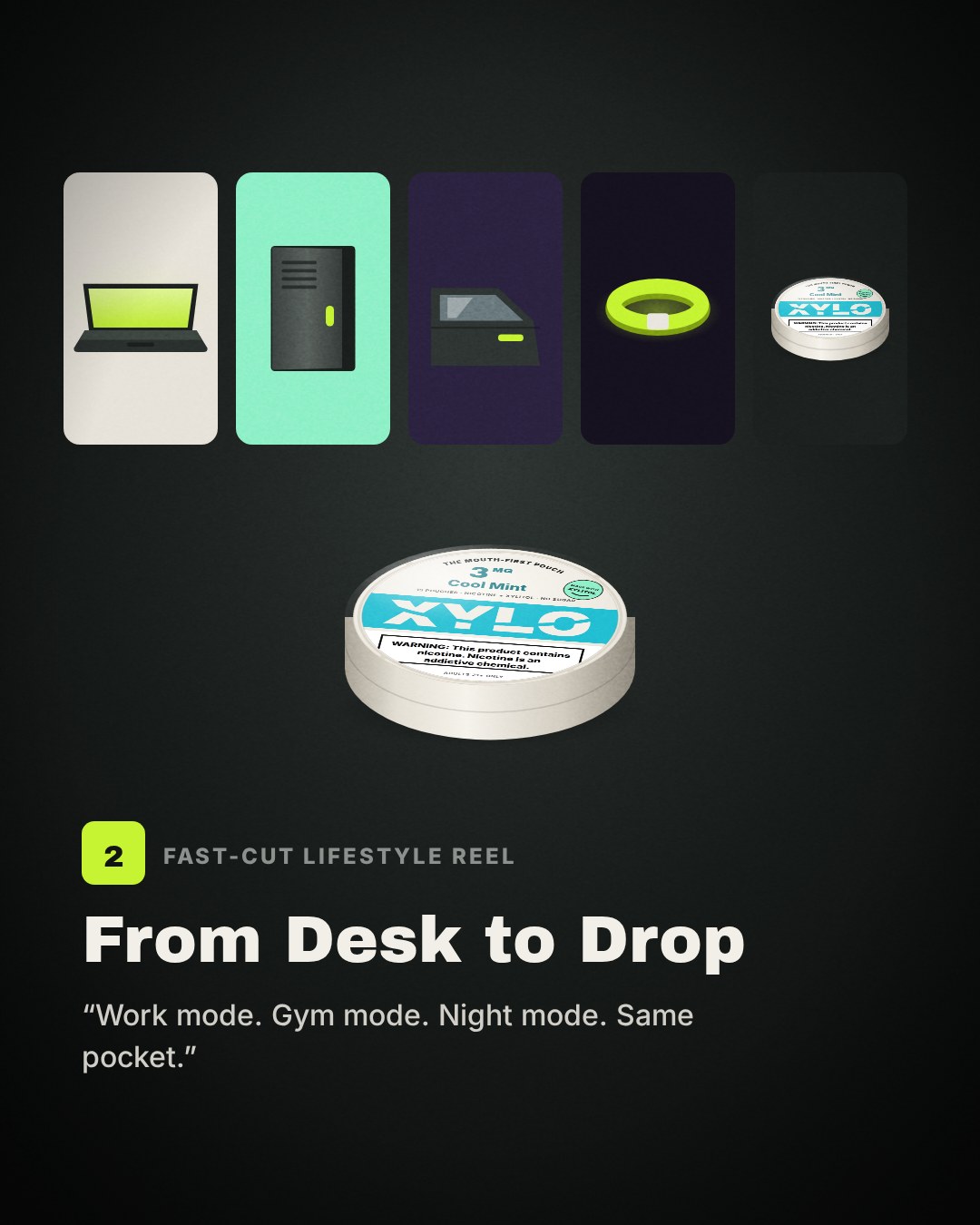
From Desk to Drop. Tests range: one carry across every setting.
 Produced
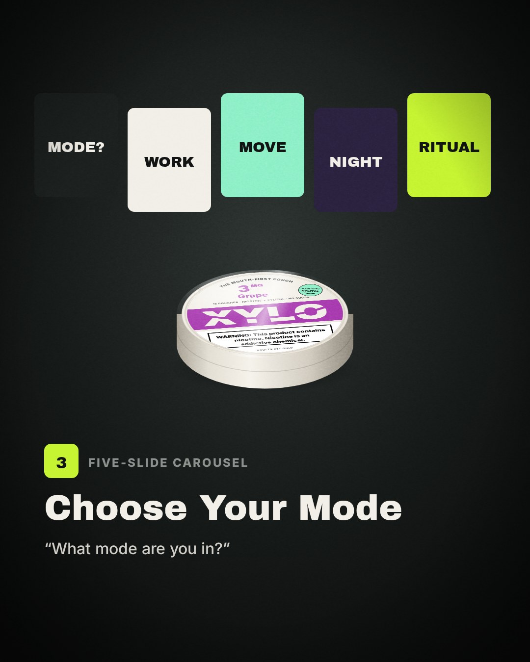
Choose Your Mode. Tests taste: flavor as self-expression, with only verified flavor facts.
 Produced
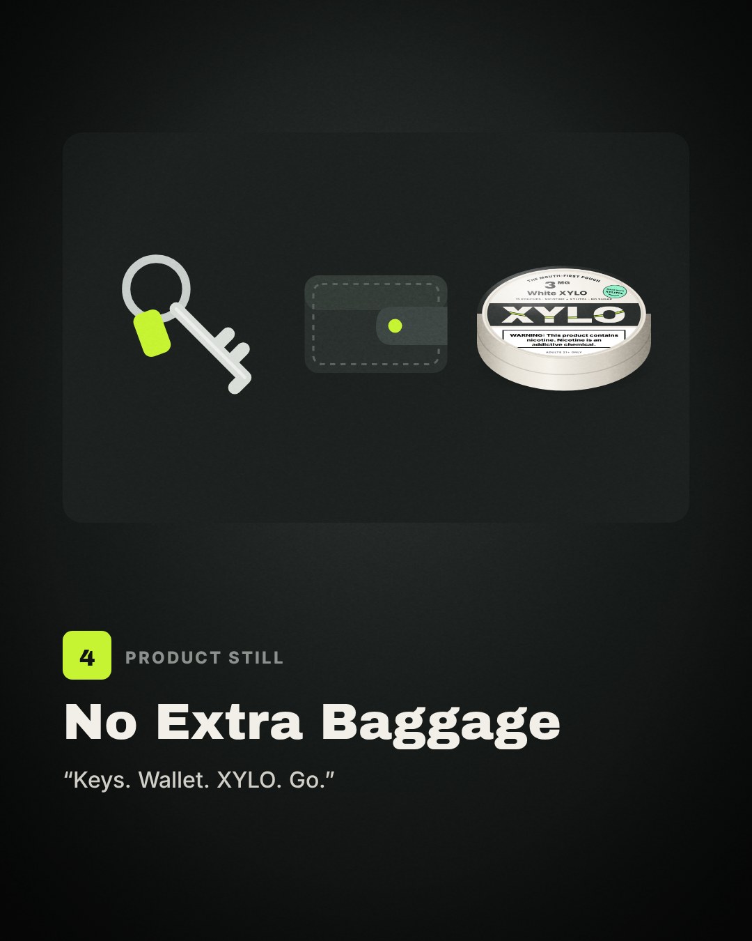
No Extra Baggage. Tests simplicity: a lighter everyday carry.
 Bonus
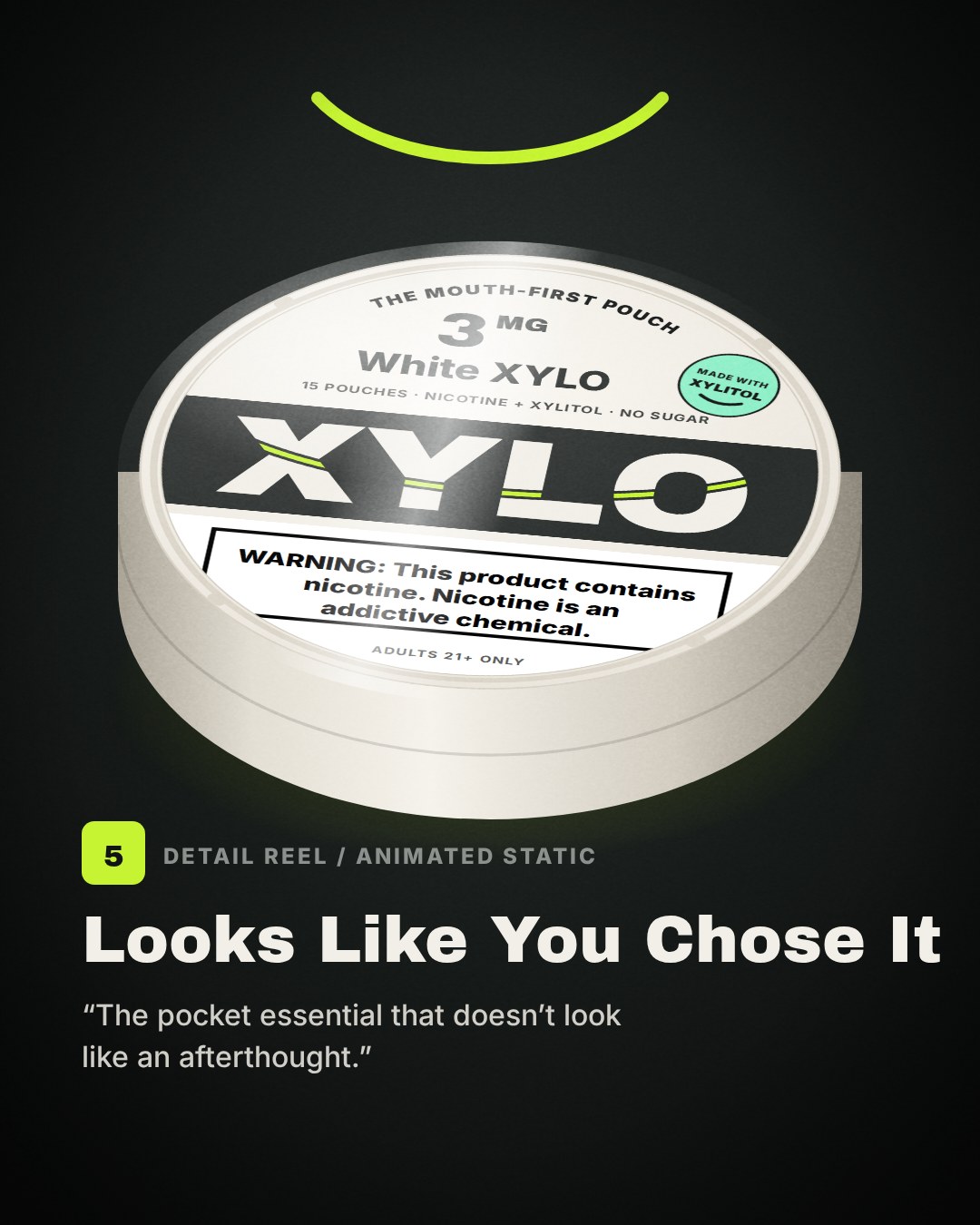
BonusLooks Like You Chose It. Tests design: the can as something you'd pick on purpose.
Adapt the message. Don't just resize it.
The reels are animatics: motion prototypes with the final copy, timing, captions and end cards, so a shoot can follow the exact edit. Each one is cut to a 100 BPM track with object clicks on the cuts and whooshes on the smile-shaped wipes. Turn the sound on.
Hero reel: Pocket Reset
Angle 1 · 25 s · vertical · creator voiceover| 0–2s | “My day changes every two hours.” Three jump cuts: laptop, gym bag, venue lights. |
| 2–5s | “Work. Training. Then wherever the night goes.” The can drops into three different carries, one per beat. |
| 5–8s | “So I like the small things to stay simple.” The can rises into a spotlight as a highlight sweeps the lid. |
| 8–13s | “XYLO fits the carry without taking over the carry.” Overhead carry layout; clutter leaves one piece at a time. |
| 13–18s | Made with xylitol. No sugar. One strength: 3 mg. Then the positioning in lime: The mouth-first pouch. |
| 18–22s | Moving-day montage, then “Carry your ritual.” |
| 22–25s | “Meet XYLO.” The smile draws itself into the logo on a chime. Adults 21+. |
From Desk to Drop
Angle 2 · 14 s. Six match cuts on the beat: laptop closes, locker shuts, car door closes, wristband snaps, the can drops into a pocket, end card. “Work mode. Gym mode. Night mode. Same pocket.” Each object lands on a click, each cut on a lime flash.
Detail loop Bonus
Angle 5 · 8 s, seamless loop. The can turns slowly under hard light while a highlight sweeps across the lid, set to a soft pad that loops cleanly. One line only: “Looks like you chose it.”
Carousel: Choose Your Mode
Angle 3 · five slides · 1080 × 1350 · tap to enlargeStatic: No Extra Baggage
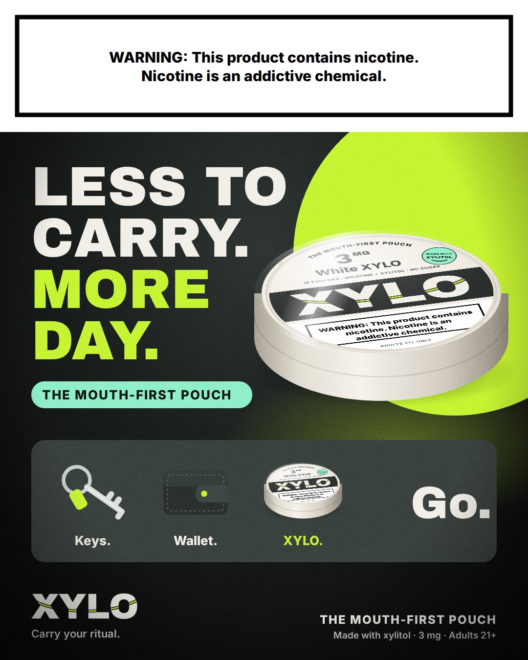
Angle 4 · 1080 × 1350“Less to carry. More day.” The hook “Keys. Wallet. XYLO. Go.” becomes a tray layout, the 3D can sits on a lime spotlight, and the mint positioning chip sits right under the headline so it reads in the first glance.
Every asset carries the nicotine warning in its top 20%, “The mouth-first pouch,” and “Adults 21+.” Pack shots are 3D renders built from the can design files; a real shoot would replace them with photography of a printed mockup.
Three openings, one I'd test first.
Same 25-second hero reel, only the first two seconds change. Switch between them in the player above.
| Opening | Line | What it bets on |
|---|---|---|
| Original | “My day changes every two hours.” | Relatability. Strong voice, but the product's job isn't clear until second 5. |
| Hook A | “If it doesn't fit in this pocket, it doesn't come.” | A rule the viewer can picture in one second. The can drops in by second 2. |
| Hook B | “My everyday carry was getting ridiculous.” | A problem people recognize. Visual chaos earns the stop. |
| Hook C | “This is the five-second reset between everything.” | A ritual and a countdown. Most distinct, but the furthest from the product. |
Hook A shows the product earliest, which the brief's own performance notes ask for, and it works with the sound off. Running it against the original isolates one question: does a clear rule beat a relatable feeling in the first two seconds? I'd judge it on three-second views and average watch time, with saves as the tiebreaker.
What was completed, and nothing invented.
I developed five creative angles and produced seven channel-ready assets around one positioning system, and revamped the can so the positioning shows up on the product itself. The project strengthened my process for moving from product truth to hook, storyboard, production and final design.
Nothing here was published, so there's no performance to report. It's a creative prototype. If it ran, I'd record reach, three-second views, average watch time, completion rate, saves, shares, profile visits and comments at consistent checkpoints, with the sample size.
One strength, one weak point, one next test.
Strength
The positioning lives on the product, not only in the ads. The smile cut, the arc line and the xylitol seal make every pack shot repeat the idea for free.
Weak point
These are animatics, not footage. The edit, timing and copy are locked, but the creator performance and real light still need a shoot with a printed can mockup.
Next test
Shoot Day 4 from the shot list, then run Original vs. Hook A in an age-verified channel and test the positioning chip on vs. off on the static.